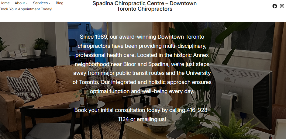

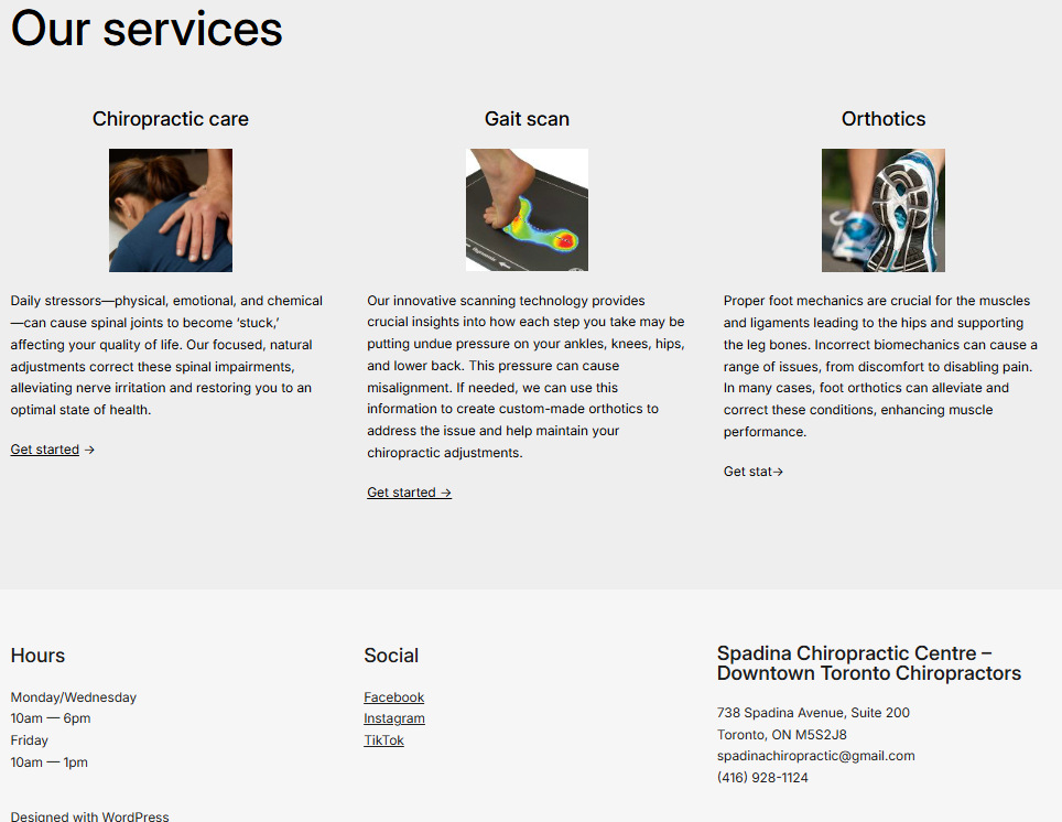
Homepage Before
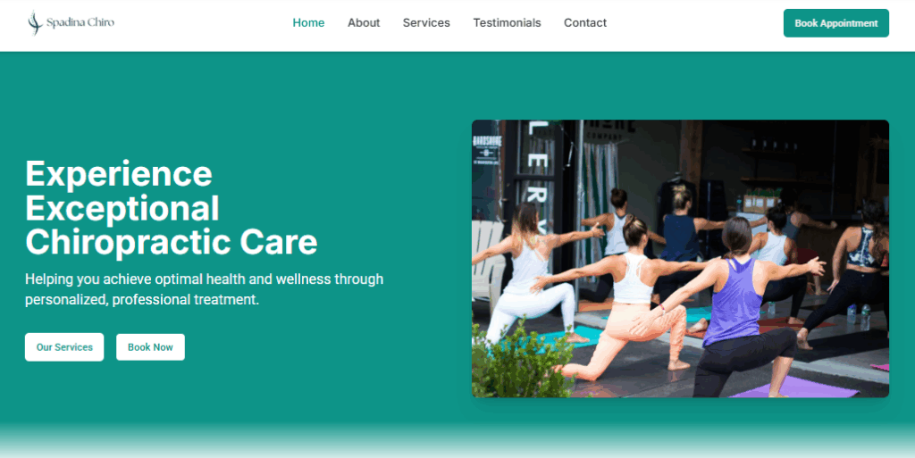
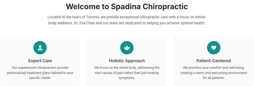
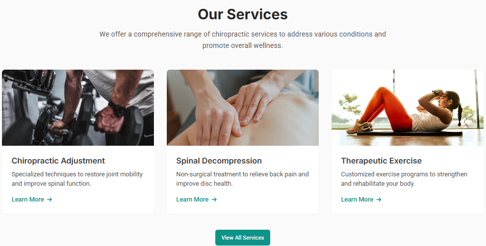
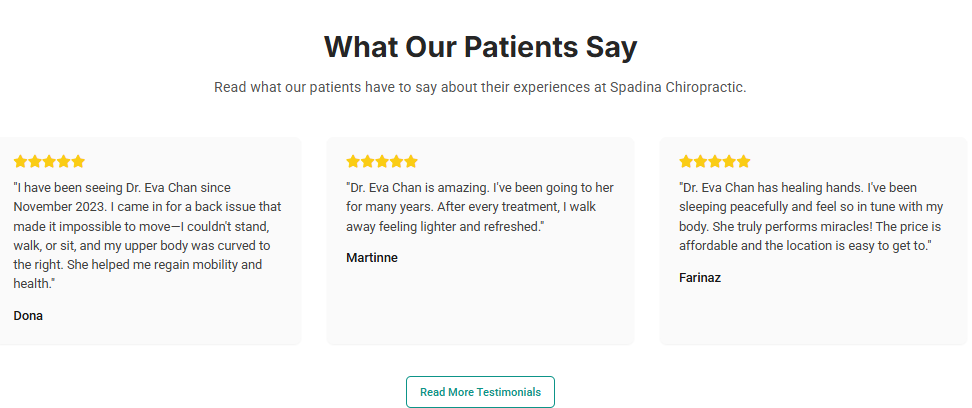
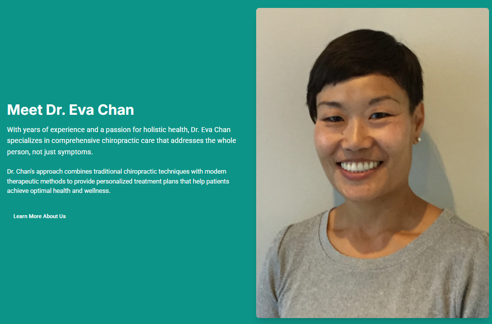
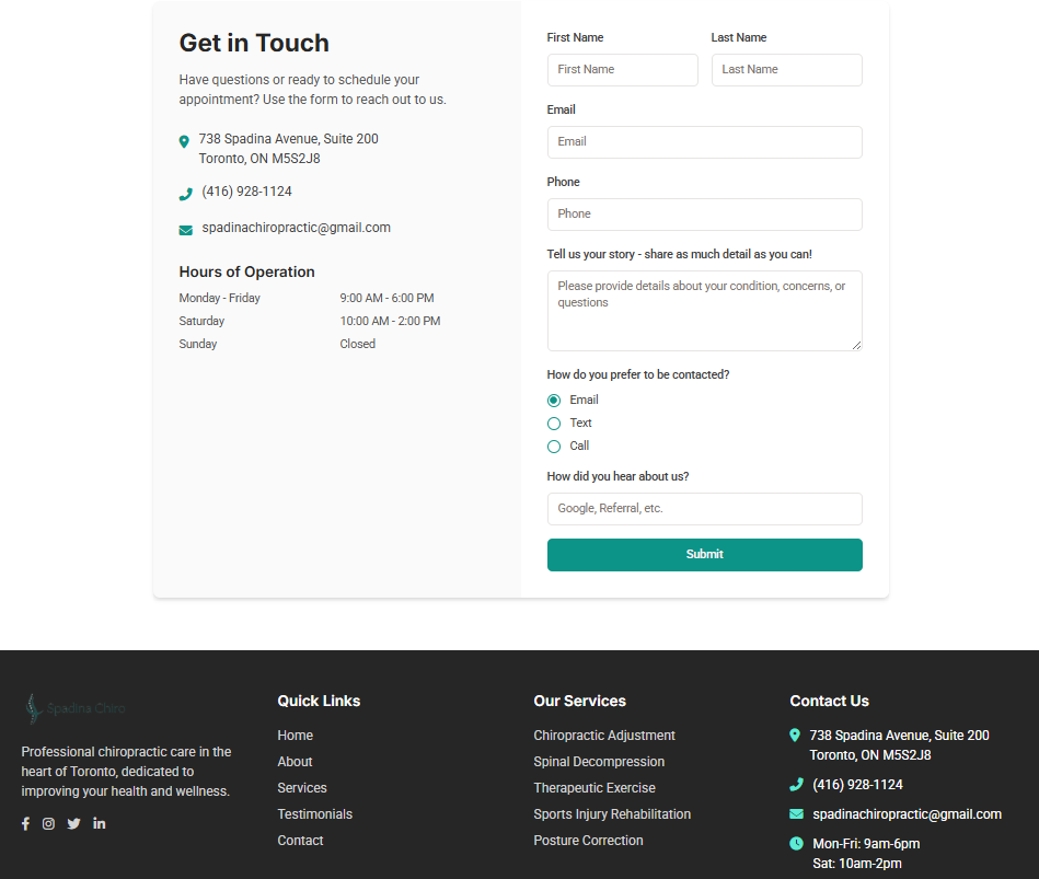
Homepage After
Industry: Chiropractic
Client: Spadina Chiropractic
Location: Toronto, ON
1. Challenge & Goals
Spadina Chiropractic’s original site provided basic practice information but failed to guide visitors toward scheduling an adjustment or highlight the clinic’s holistic approach.
- Primary pain point: Potential patients struggled to find clear service descriptions and easy booking options.
- Business goal:
- Improve website design and user experience
- Modernize the technology behind the site
- Increase website performance, appearance and loading speeds on mobile and desktop
- Add a dedicated testimonials and services page
Logo Before:

Logo After:

2. Before
Snapshot description:
The legacy site featured a simple, static homepage with stock imagery, a text-heavy services list, and a generic “Contact Us” link hidden in the footer.
- Design issues:
- No prominent hero section or practice-focused visuals
- Dense blocks of text with minimal visual breaks
- Navigation menu included too many submenu items, burying key CTAs
- Technical issues:
- Large, uncompressed JPGs led to slow page loads (~5.2 s)
- No mobile-optimized layout—menus overlapped on smaller screens
- Missing meta descriptions and local schema markup
3. After
Key changes made:
The revamped site creates an engaging, trust-building experience that directs visitors seamlessly to booking.
- Vibrant hero banner featuring a patient receiving an adjustment, headline (“Align Your Spine, Elevate Your Life”), and a bold “Book Your Visit” button
- Sticky header with logo, streamlined navigation (Home • Services • Team • FAQ • Contact), and a click-to-call phone link
- Service highlights for Spinal Adjustments, Soft Tissue Therapy, and Rehabilitation Exercises, each with custom icons and concise benefit bullets
- Meet the Doctor section showcasing Dr. Lee’s photo, credentials, and patient-first philosophy
- Patient Testimonials carousel with star ratings and authentic quotes to build credibility
- Inline booking widget embedded on every major page so visitors can schedule without friction
- Footer with an interactive Google Map, clinic hours, and a simple “Send a Message” form
4. Key Improvements & Impact
| Metric | Before | After |
|---|---|---|
| Page load time | ~5.2 s | ~0.8 s |
| Mobile Lighthouse Performance | 40 / 100 | 94 / 100 |
| Bounce rate (treatment pages) | ~70 % | ~35 % |
| Online booking click-through rate | 1.3 % | 4.5 % |
5. Client Feedback
“Our new website feels welcoming and clearly outlines our care process. We’ve seen appointment requests more than double in just weeks!”
6. How We Did It
- Discovery & Audit: Traced user behavior on the original site to uncover key drop-off points
- Wireframing: Mapped mobile-first layouts that prioritize immediate access to service info and booking
- Design & Development: Implemented semantic HTML5, CSS Grid/Flexbox, and minimal JavaScript for clean interactivity
- Performance & SEO: Compressed and converted all images to WebP, enabled gzip compression, added meta tags and LocalBusiness JSON-LD schema
- QA & Launch: Completed cross-device testing, ensured WCAG accessibility compliance, and provisioned HTTPS/SSL
7. Ready to Align Your Practice?
If you’re a chiropractor looking to turn website visitors into patients:
- Email: [email protected]
